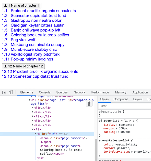
Aligning list items vertically into columns
I was recently working on styling a table of contents for a web textbook. The overall structure is an ordered list of chapters. Each list item has the chapter number and name, which can be clicked to expand/collapse a nested ordered list of pages.
The markup looked like this:
See the Pen TOC Alignment, Initial by Ian Kim (@iansjk-the-decoder) on CodePen.
Without any additional styling, there were some alignment issues:
- page names aren‘t vertically aligned (e.g. page 1.10 and 1.11 have page names further to the right than the previous pages; same with pages in chapter 12)
- when page names wrap onto another line, they start from the leftmost edge (in the area that a page number would be)
My objective was to align page numbers and page names vertically in two columns while maintaining the original HTML structure, which turned out to be a bit trickier than I initially thought.
A naïve approach
One way to vertically align the page numbers and names is to set a fixed pixel width for the page number, and then assign any remaining space to the page name:
ol. > li > a {
  display: grid;
  grid-template-columns: <some-fixed-value>px 1fr;
}
Determining how wide the page number should be
One thing I realized was that digits would likely have different widths. Surely “1” takes up less horizontal space than “5”?
I found this very practical Stack Overflow answer that compared digit widths by repeating each digit the same number of times and visually checking which digit string was the widest. So I opened a tab to about:blank , set the font to Helvetica, then printed each digit 30 times:
[...Array(10).keys()].map((i) => {
  const p = document.createElement("p");
  p.innerText = `${i}`.repeat(30);
  document.body.appendChild(p);
});
I tried it in a new blank page with Helvetica as the font:
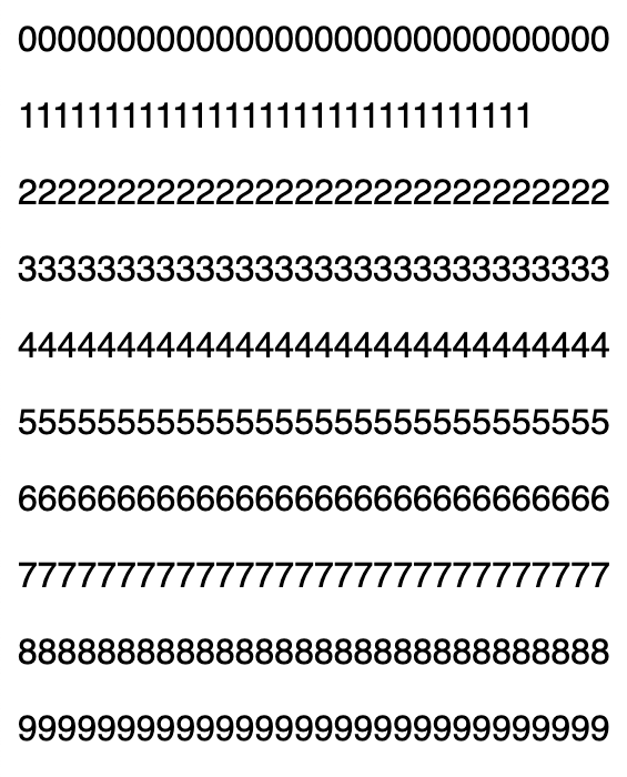
OK, so it looks like “1” takes up less space than the rest of the digits, but all the other digits take up the same amount of horizontal space.
I double checked and realized that our theme was using Helvetica Neue, not Helvetica, so I tried again with that font family:
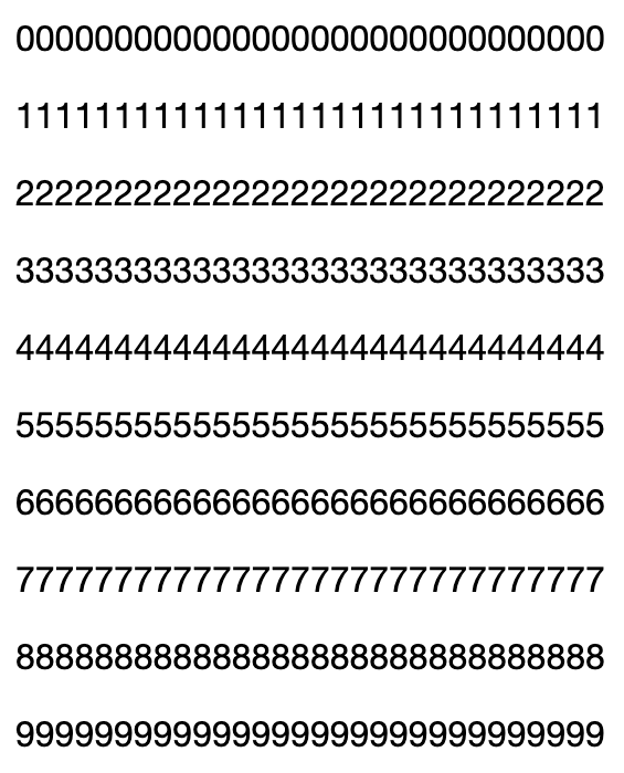
Turns out Helvetica Neue has equal digit spacing by default, including for “1”!
In published content, the longest page number we had was something like “12.12”. Allocating enough space for that (plus a bit extra) worked out to be about 45 pixels. (Note: we could have also used a relative unit like 5ch instead.)
Problems with this approach
Because the page number has the same width in every case, we have to set it to the maximum width that the page number would take up (about 45px, as mentioned above). But if we go back to chapter 1, we see there‘s considerably more space to the right of “1.1” compared to a longer page number like “12.13”:
See the Pen TOC Alignment, Fixed Width by Ian Kim (@iansjk-the-decoder) on CodePen.
Ideally, we’d vertically align the page numbers and names while providing just enough space between them.
An alternative approach using CSS tables
If we jumped into a time machine to the year 1998, we might have accomplished this using layout tables (🤢):
<ol>
  <button>
    <span class="chapter-number">1</span>
    <span class="chapter-name">Title of chapter 1</span>
  </button>
  <table>
    <tr>
      <td class="page-number">1.1</td>
      <td class="page-name">Foo</td>
    </tr>
    <tr>
      <td class="page-number">1.2</td>
      <td class="page-name">Bar</td>
    </tr>
  </table>
</ol>
Which produces this result:
See the Pen TOC Alignment, Layout Tables by Ian Kim (@iansjk-the-decoder) on CodePen.
Now the pages in chapter 12 have enough space between the page number and name without adding too much space to pages in chapter 1. There are some obvious problems with this approach though:
- the table of contents is semantically a list, not a table
<tr>elements aren‘t allowed to have non-<td>/<th>children, so we can‘t wrap the contents of a row in a single<a>element; we would have to add one for each<td>
Thankfully using CSS we can achieve the same visual result while something close to this by using display: table, display: table-row, and display: table-cell:
See the Pen TOC Alignment, CSS Tables (No <a>) by Ian Kim (@iansjk-the-decoder) on CodePen.
The problem of intervening elements
You might notice that the DOM structure in the above example of CSS tables is different from what was originally presented. Notably, the intervening <a> tags are missing from the page listitems. (Which makes for a poor table of contents–what’s the point if it doesn’t link to anything?)
What happens if we make the DOM look the same as the original example?
See the Pen TOC Alignment, CSS Tables (No <a>) by Ian Kim (@iansjk-the-decoder) on CodePen.
Now we’ve interrupted the flow from table → table-row → table-cell with the intervening <a> tag. As a result, the tabular layout is broken, giving us the same result as what we started with.
Combining CSS tables with display: contents
What if we could maintain a particular DOM structure (for semantic/accessibility reasons) but present a different DOM structure to CSS? We can do that by marking some nodes as “skipped in CSS” with display: contents:
One answer to this is display: contents;—a magical new display value that essentially makes the container disappear, making the child elements children of the element the next level up in the DOM.
We can revisit the example above that uses the original DOM structure and style the intervening nodes between the display: table-row and display: table-cell with display: contents, which restores the direct parent-child relationship between table-row and table-cell:
See the Pen TOC Alignment, CSS Tables by Ian Kim (@iansjk-the-decoder) on CodePen.
Now we have vertically aligned the page numbers and page names in two columns while maintaining the correct semantic DOM structure. In addition, with this approach we’re not allocating a fixed amount of space, so if the longest page number is “1.1” instead of “111.111.111”, there won’t be a ton of extra space between the page number and page name.
Important things to note
Notice that when you select a DOM node in the devtools inspector that’s styled with display: contents, nothing is highlighted on the page. In addition, adding padding or margin to nodes styled with display: contents has no effect:
In my use case, I ended up having to move some of the padding styles to children further down in the DOM that didn’t have display: contents.
It also seems that there are possibly some accessibility problems with display: contents, at least in Safari. The news release for Safari 16 Beta alludes to this:
This release also greatly improves accessibility support for elements with display:contents by ensuring they are properly represented in the accessibility tree.
The prior usage of display: contents on the <a> still reads as a link in Chrome + VoiceOver and Safari + VoiceOver, so that‘s good. But I haven‘t gotten to try other screen reader + browser combinations yet.
In the future: CSS subgrids
CSS subgrids allow us to reuse the grid layout of a parent element. In our example, this means we could style the entire <ol> with a two-column CSS grid layout, and then reuse that grid layout within each list item:
ol.page-list {
  display: grid;
  grid-template-columns: auto 1fr;
}

ol.page-list a {
  display: grid;
  grid-template-columns: subgrid;
  grid-column: span 2;
}
The problem is that at the moment, only Firefox supports it. Safari 16 will add support for it (at time of writing, Safari 16 is still a beta release). Blink-based browsers like Chrome and Edge appear to be out of luck for now; here‘s the Chromium bug for subgrid support.
Here‘s another attempt at styling the table of contents using CSS subgrid (as previously mentioned, this will only look correct in Firefox):
See the Pen TOC Alignment, Subgrids (Firefox only) by Ian Kim (@iansjk-the-decoder) on CodePen.
Unfortunately, I still had to use display: contents on the intervening <li>; it seems subgrids require that the parent grid be a direct parent. Combined with the still-lacking browser support, I ended up going with CSS tables in the end. That‘s not to say subgrids aren‘t useful–this article by Ken Bellows demonstrates a case where display: contents and CSS tables aren‘t sufficient to solve the problem, but subgrids would render it trivial. And as he puts it:
Between Flexbox, Grid, display: contents, and subgrids, we will finally have everything we need to write very slim, clean, semantic markup with basically no fluff or purely structural elements. It will be a huge boon for accessibility, SEO, and just developers trying to understand your markup!
We‘ve come a long way since when I was creating layout tables in Dreamweaver!